
Quality control experts lean heavily on the so-called “7 Basic Tools of Quality” to fine-tune processes as part of an overall quality assurance effort.
These basic QA tools are often associated withKarou Ishikawa, a Japanese thinker who’s credited as a heavyweight in quality management and who is especially known for the development of thequality circleandIshikawa, or fishbone, diagram, which is itself one of the 7 basic tools we’ll talk about in this article.
And as is often the case in quality issues, you can also detect the influence ofW. Edwards Demingon the 7 basic tools.
The 7 tools are graphing techniques that people commonly use for quality control troubleshooting purposes.
So let’s start learning about these very useful techniques for quality control.
You can use the 7 basic tools of quality to help understand and solve problems or defects in any industry.
They’re easy to use and don’t require a masters degree in statistics, which is nice. And that’s even more true these days since there are software programs that can create the graphs and diagrams after you feed them the data.
If you know how to use the 7 basic tools, they’ll give you a big help with solving the problems you face at work on a daily basis.
An Ishikawa diagram is also known as a fishbone diagram; that’s because it looks like a child’s drawing of a fish skeleton. It’s also known as a cause-and-effect diagram because it’s often used to show the cause of some effect.
Here’s an example fishbone diagram in the image below.
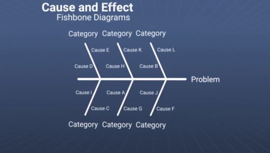
In addition to using fishbone diagrams to identify the cause of an event, people also use them find the cause of a problem or for other reasons.
You should always draw the “fish skeleton” of an Ishikawa diagram so that the “head” of the fish points to the right. The head represents the problem or cause. The “bones” of the fish branch off the central, horizontal spine and angle backward to the left. Each bone represents one possible major cause of the event. You can add smaller bones branching off each major bone to represent sub-causes related to that major cause.
In analyzing production processes, the 6M fishbone design is often used. In 6M, the potential major causes are:
The 6M method is illustrated below.
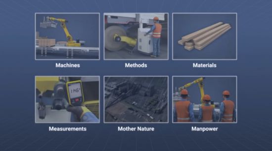
You can’t use the 6M cause-and-effect diagram for every situation, but it can be a helpful way to begin organizing thoughts for many. For other problems, you may need to come up with your own causes.
Because it seems that nothing’s ever simple and easy, you will sometimes seen this listed as the 5 Ms (machine, method, material, man, measurement) and even see it sometimes expanded to 8 Ms (including mission, mother nature, management, and maintenance). Use what works best for each scenario.
A check sheet is a sheet or form you can use to collect and then later analyze data. It’s typically created at the location where the data is created, such as at the end of a production line.
People often use check sheets to collect data on the frequency, location, or even cause of problems or defects that occur during production.
The check sheet is divided into a number of different regions, and data is then marked into the different regions using different types of marks to indicate different types of problems. The total number of each type of problem is also recorded.
Below is an example check sheet for quality purposes.
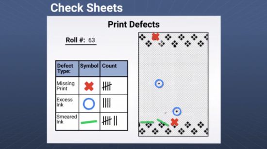
In general, a check sheet will include headings that provide the following information:
You can use check sheets to describe and then analyze the results of a procedure, as explained above.
But in addition, you can also use check sheets to track of the completion of the different steps of a procedure. In this case, the check sheet is often known as a checklist.
The checklist concept is all about creating a list of procedures for a worker to follow so he/she won’t make a mistake. This type of check sheet is especially useful during multi-step procedures, and in quality it’s often used when checking and finishing process outputs.
For more about checklists, you may also want to check out:
You may also be interested to learn more aboutmobile digital tools for checklists, such as the one shown below.

You can use a process control chart to track the values of a process over time. They’re also known as Shewhart charts (afterWalter A. Shewhart) or process-behavior charts.
The vertical dimension of the chart usually represents a process value or measurement, and the horizontal dimension usually represents time–when the measurement was taken or how often it was taken. Control charts are great for analyzing and reducing variation in a process, and you can use them to determine if a process is “in control” or not.
Although there are different types of control charts for different types of data, all control charts have a center line that represents the average or mean and two parallel lines (above and below that center line) that represent the upper and lower control limits.
You can see an example control chart below. Note the two axes chart a given variable and time, the solid horizontal line represents the average or mean, and the dotted lines represent the control limits.
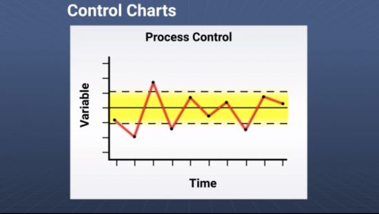
控制图是背后的一些概念briefly explained in this short sample from ouronline process control charts training course, below.
There are several conditions that indicate the process is out of control, including having at least one point outside the control limits or having nine points in a row on the same side of the centerline.
Here are some examples of how process control charts might be used at production facilities:
You can use a process control chart to measure a wide range of process behaviors, such as:
A histogram is a graph that shows how often a value, or range of values, occurs within a given time period. Histograms provide a visual summary of large amounts of variable data. Histograms were first introduced byKarl Pearson.
An example histogram is shown below.
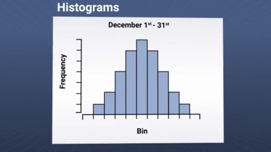
The shape of the distribution can tell you a lot about the data set. Using a histogram, you can tell:
You can also use histograms to compare two different processes.
To create a histogram, start by determining the intervals or “bins” that represent the range of values, then determine how many values fall into each bin. The bins are typically consecutive, non-overlapping, and of the same size (though that last one isn’t required).
Once all the values are plotted into the bins of a histogram, the patterns of the histogram are described as:
帕累托图是基于Pareto principle, or 80/20 rule, which states that roughly 80% of the effects are caused by 20% of the problems. Pareto charts are named afterVilfredo Pareto, as is–you guessed it–the Pareto Principle.
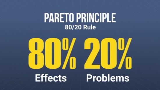
In a Pareto chart, the vertical axis on the left often represents the frequency of occurrence. The right vertical axis represents the cumulative percentage of the total number of occurrences. The chart itself includes bars and a line graph.
Each bar in a Pareto chart represents the relative frequency or magnitude of a problem or cause. The bars are arranged in descending order, with the longest or tallest on the left, and the shortest on the right. And the line graph shows the percentage of total data included up to that problem category.
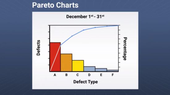
Arranging the bars in this way allows you to visually identify the most significant data groups, which helps you zero in on and prioritize the most significant problems. In quality control, the Pareto chart is often used to represent sources of defects, types of customer complaints, and similar issues.
Scatter diagrams are also called scatter graphs, scatter charts, scatter plots, and even scattergrams. Scatter diagrams are often used to help understand how variables are related and also to identify root cause.
A scatter plot is a graph of paired numerical data samples. You plot the independent variable on the horizontal x-axis and the dependent variable on the vertical y-axis. You can then画出趋势线to study the relationship between the variables.
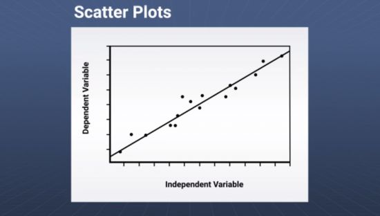
The closer the data points align with the trend line or curve, the stronger the relationship and the more likely it is that a change in one variable will change the value of another variable. Scatter plots are often paired with a regression analysis, which rates or scores the strength of the relationship between the two variables and can help predict future values.
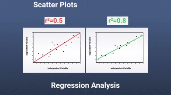
Scatter diagrams can be built as:
Stratification is a way to organize data, and in particular of separating data into meaningful groups. Stratification is also known as a flow chart or run chart.
In stratification, you should include each data point in only one group, and you should leave no data point(s) out.
Below is an example of stratification.
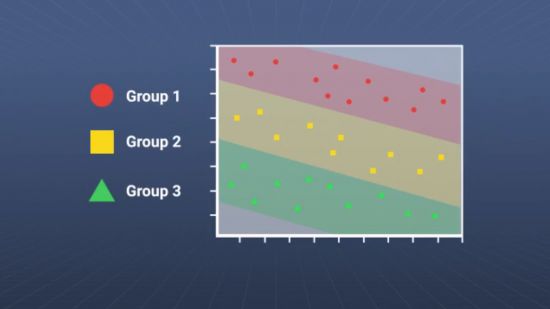
Once you’ve separated the data into groups, you can then compare the groups and see the effects of the grouping variables.
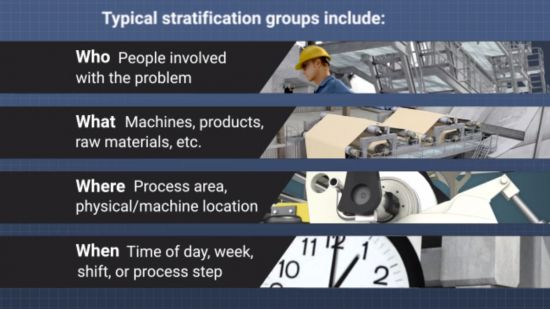
Typical stratification groups used for quality control purposes include:
Some more examples of stratification are shown below.
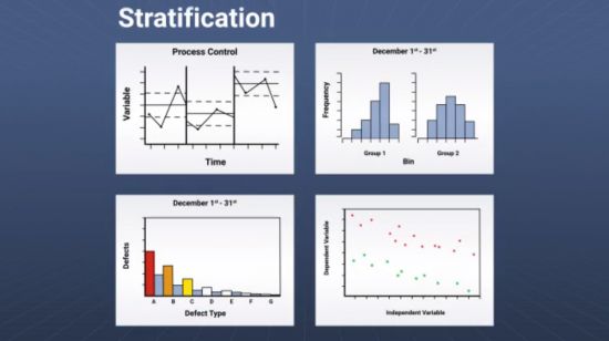
As you can imagine, there are many more possible ways to use stratification in quality analysis (and in other uses, too).
We hope you found some useful information about quality control and learned some helpful quality control tools in this article about the 7 basic tools of quality. Remember that we have anonline 7 Basic Tools of Quality training courseif you’d like to check that out.
Keep your eye on our blog for future articles looking at each tool in more depth, plus additional articles about quality control and quality assurance tools and techniques.
Also know that we’ve got an upcoming online 7 basic quality tools course that’s currently in production and will be ready for you to buy soon. It’s just another new title in ouronline manufacturing training courseslibrary.
Let us know if you’ve got any additional questions. Otherwise, we’ll catch up with you again at our next article.